Access Training
Access Training is a UK training provider for trades like electrical installation, plumbing and gas engineering. Students learn the theory online through videos, webinars, quizzes and exams, and do the practical part in person at the training centre.
Most students are adults around 30 and older, many of them changing careers. I designed the new student platform from scratch, based on requirements from the client’s product manager: around 70 screens for desktop and mobile, the design system behind them and the marketing website. The brand was created by another studio.
Finding the right Home
The Home screen had the hardest job on the platform: course progress, today’s tasks, upcoming webinars and practical bookings all compete for the same space.
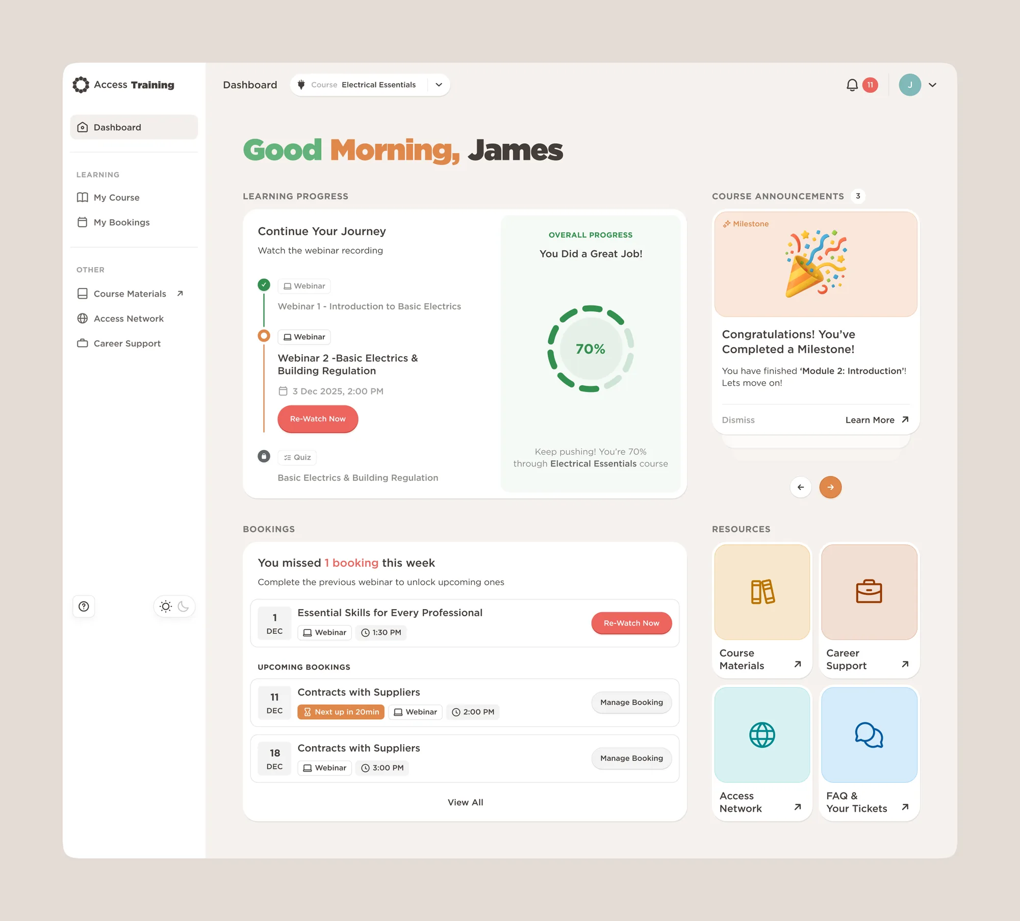
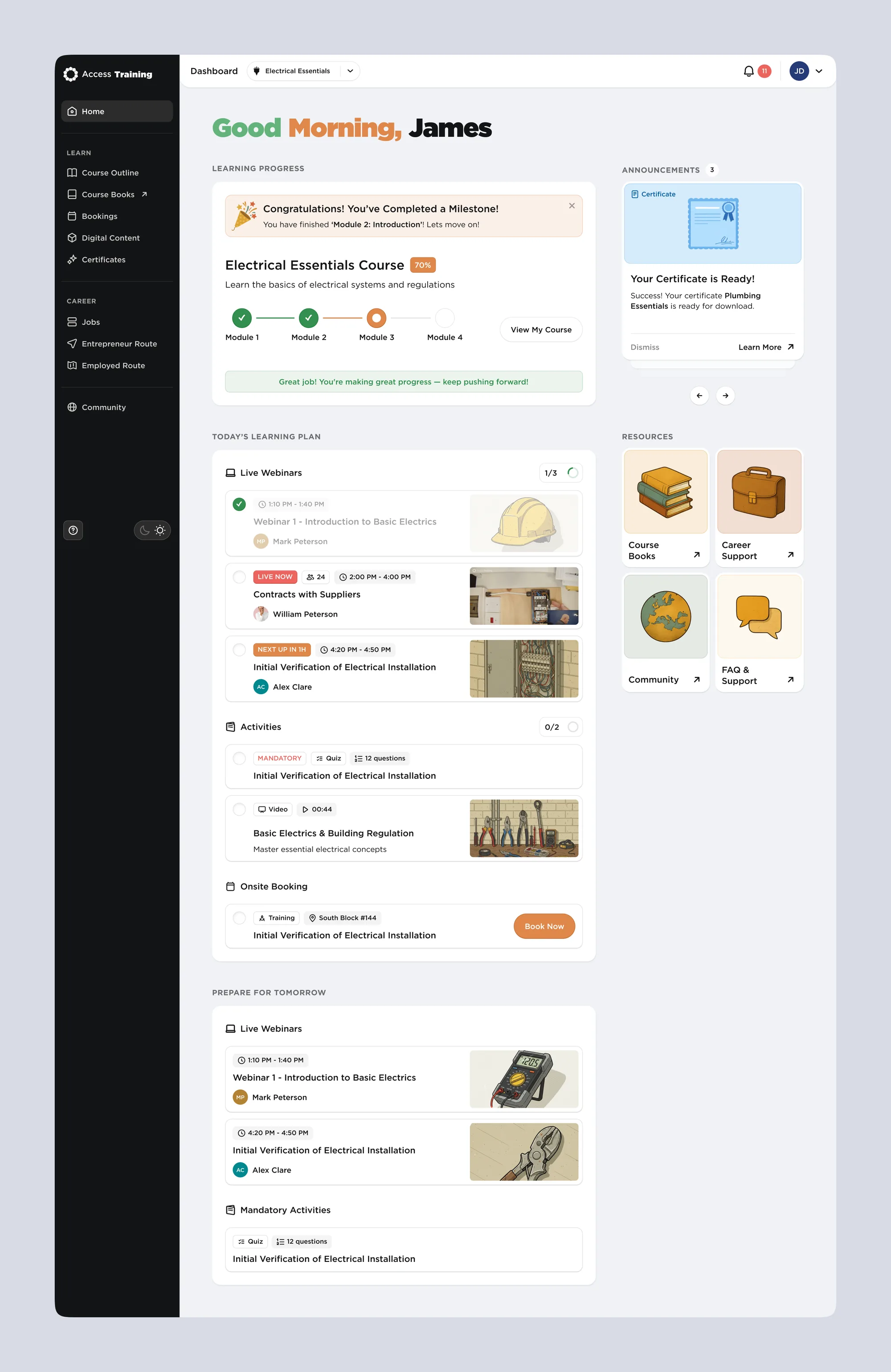
The client was still settling on the visual style, so I explored two directions before we chose the final one.
One question: what’s next?
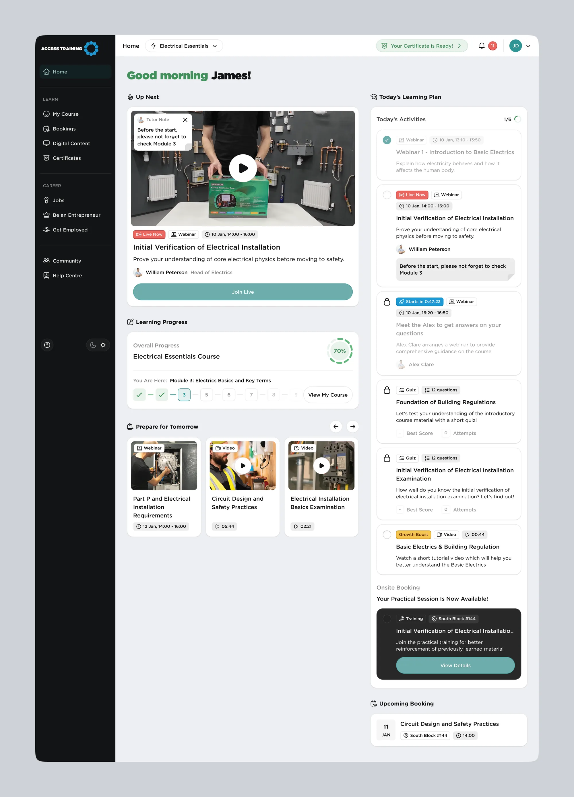
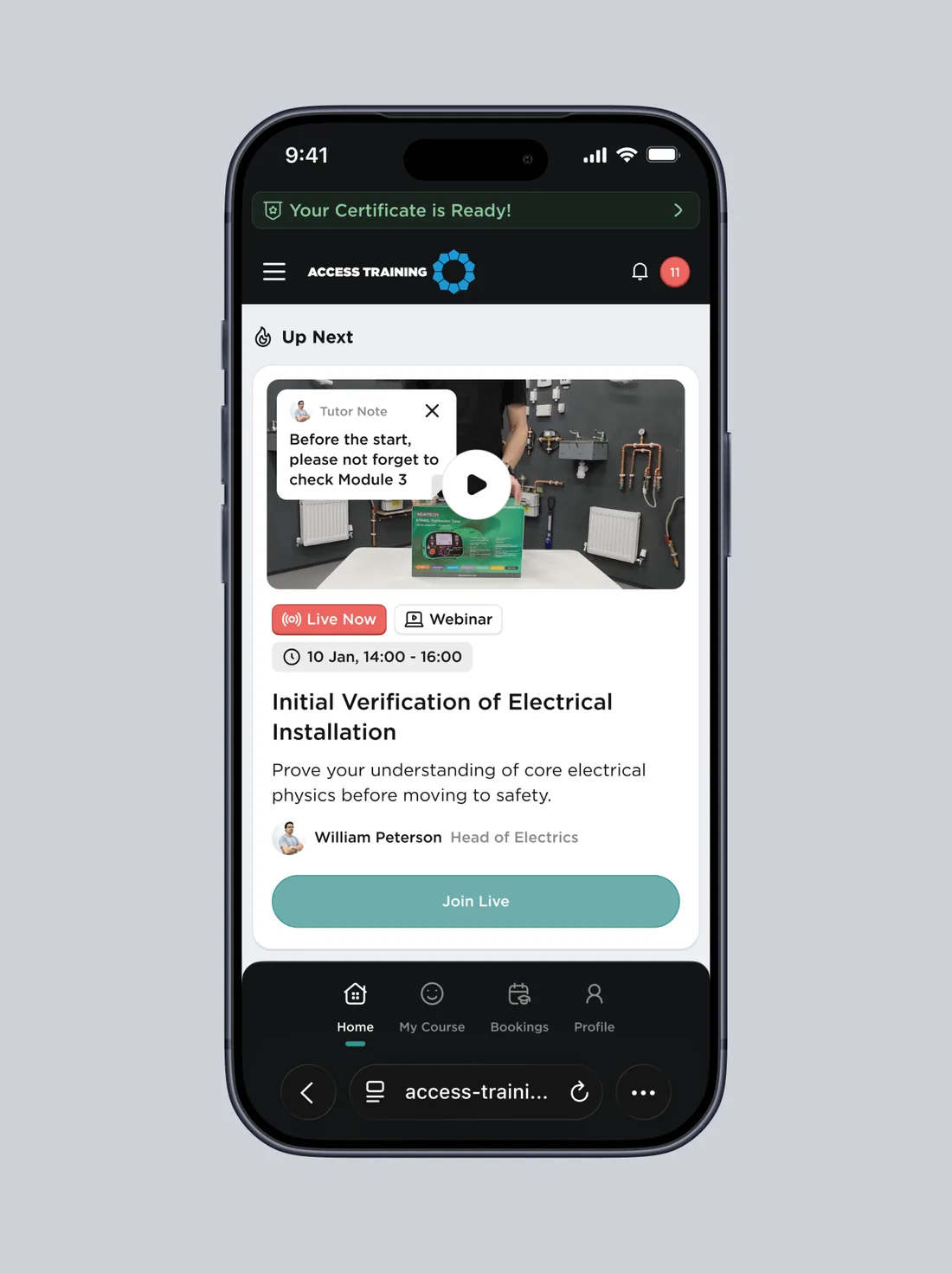
I built the final Home around what the student needs to do next.
The Up Next section comes first. It shows the next required activity: a webinar, a quiz, a form, a video or other learning content. Activities have to be completed in order, and without them there is no progress on the course, so this is the one thing a student shouldn’t miss.
Below it, Learning progress shows where the student is in the course and in each module. Prepare for tomorrow collects the material for the next day. The right panel holds Today’s Learning Plan, the list of required activities for today, with Upcoming Booking for practical sessions under it.
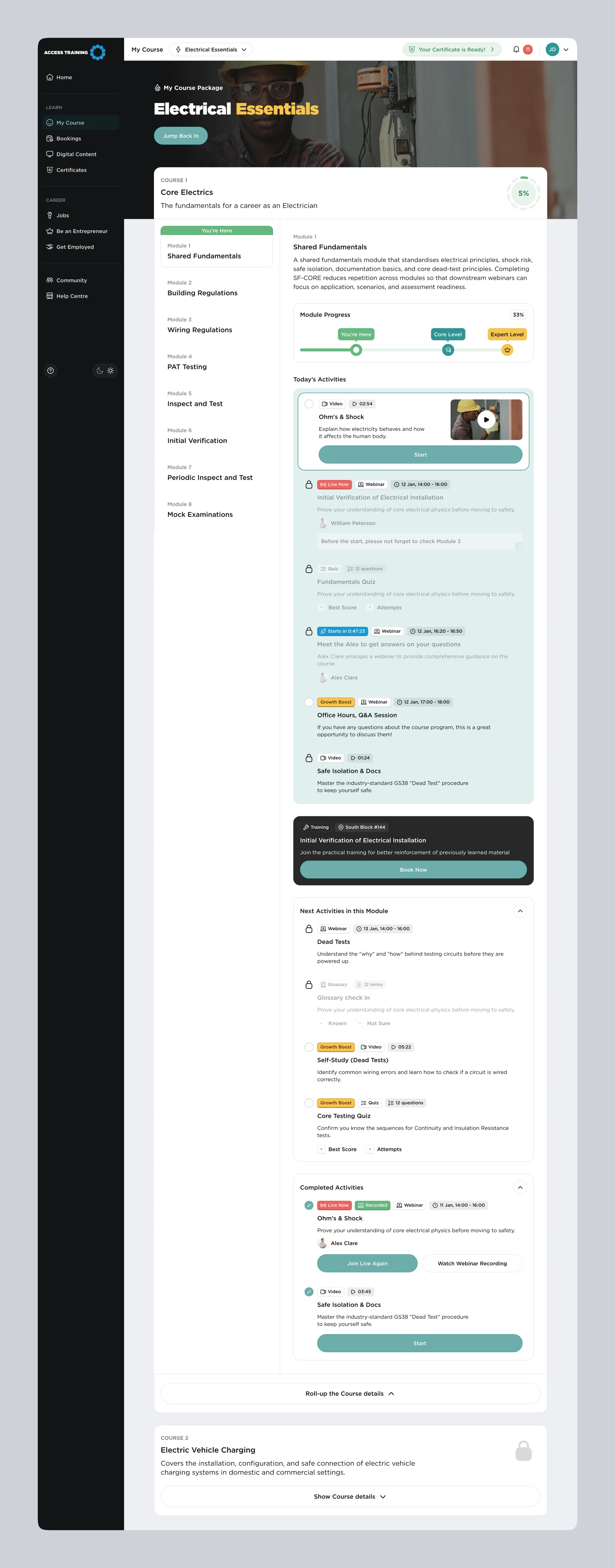
Each type of activity is a variant of one card component, so new activity types fit into the same layout.
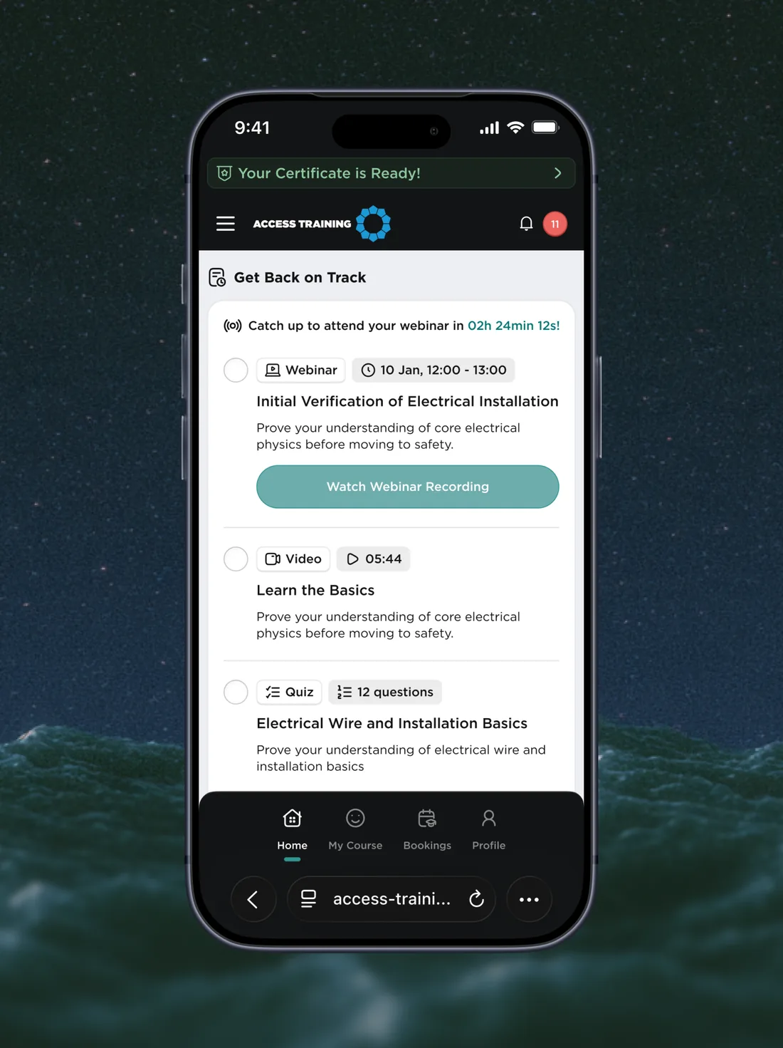
On mobile, the same sections stack in order of priority, with Up Next first.
Course outline
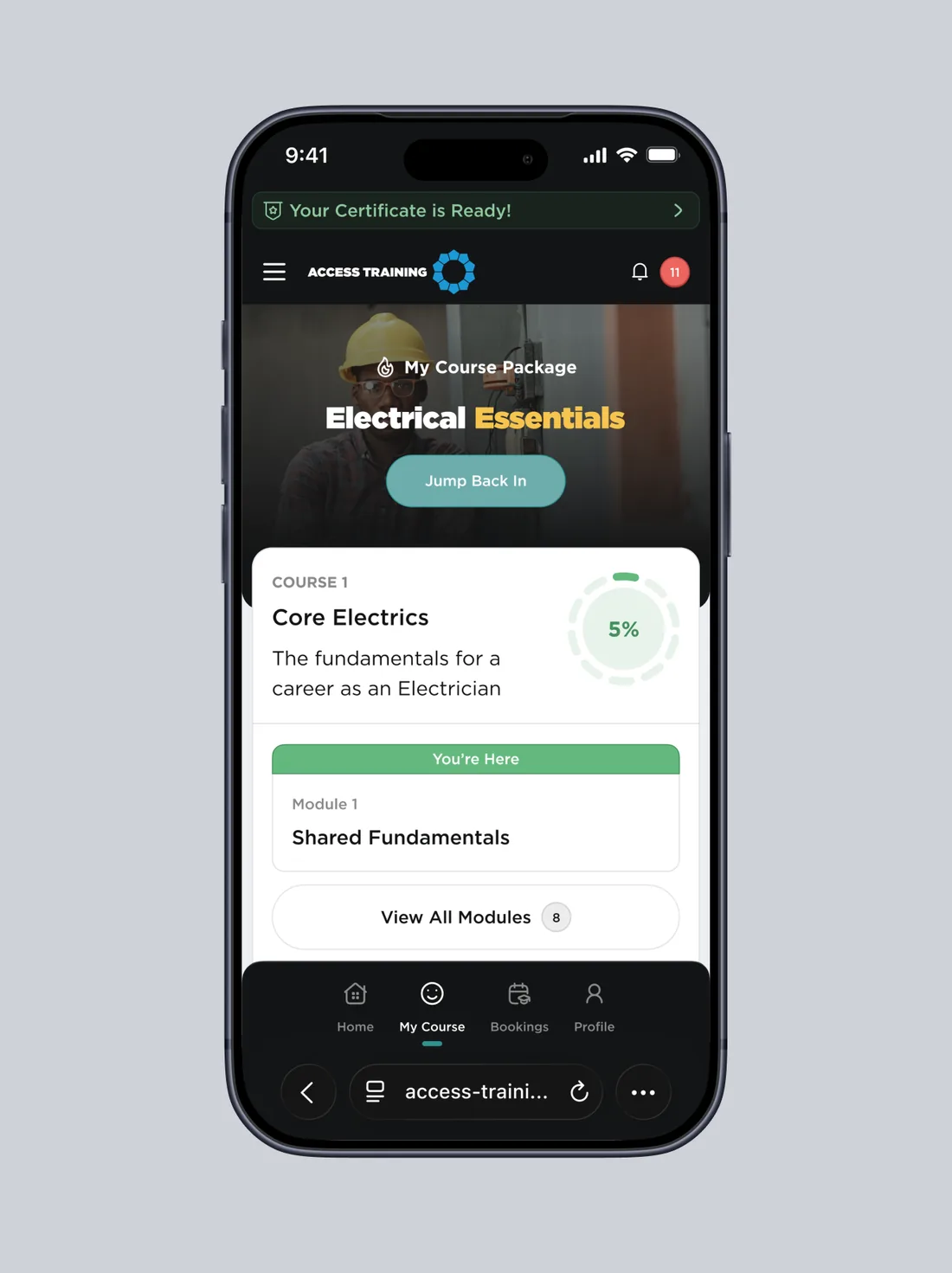
The course page shows the whole package: modules in order, the student’s progress and a clear “You’re here” marker, so returning students know where to continue.
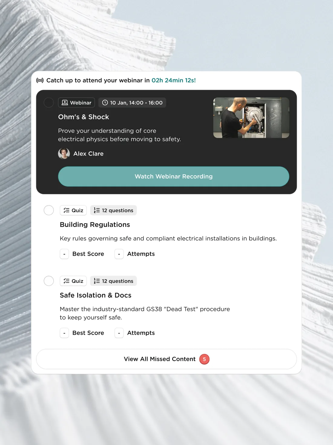
When a student misses a required activity, a Get Back on Track card lists what they missed and how much time is left to catch up before the next webinar.
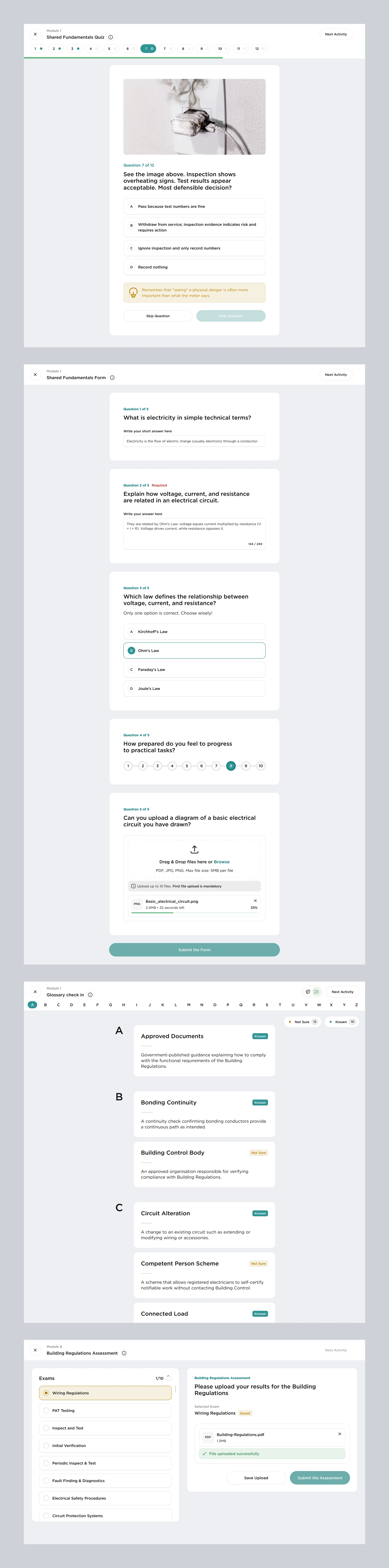
Activities
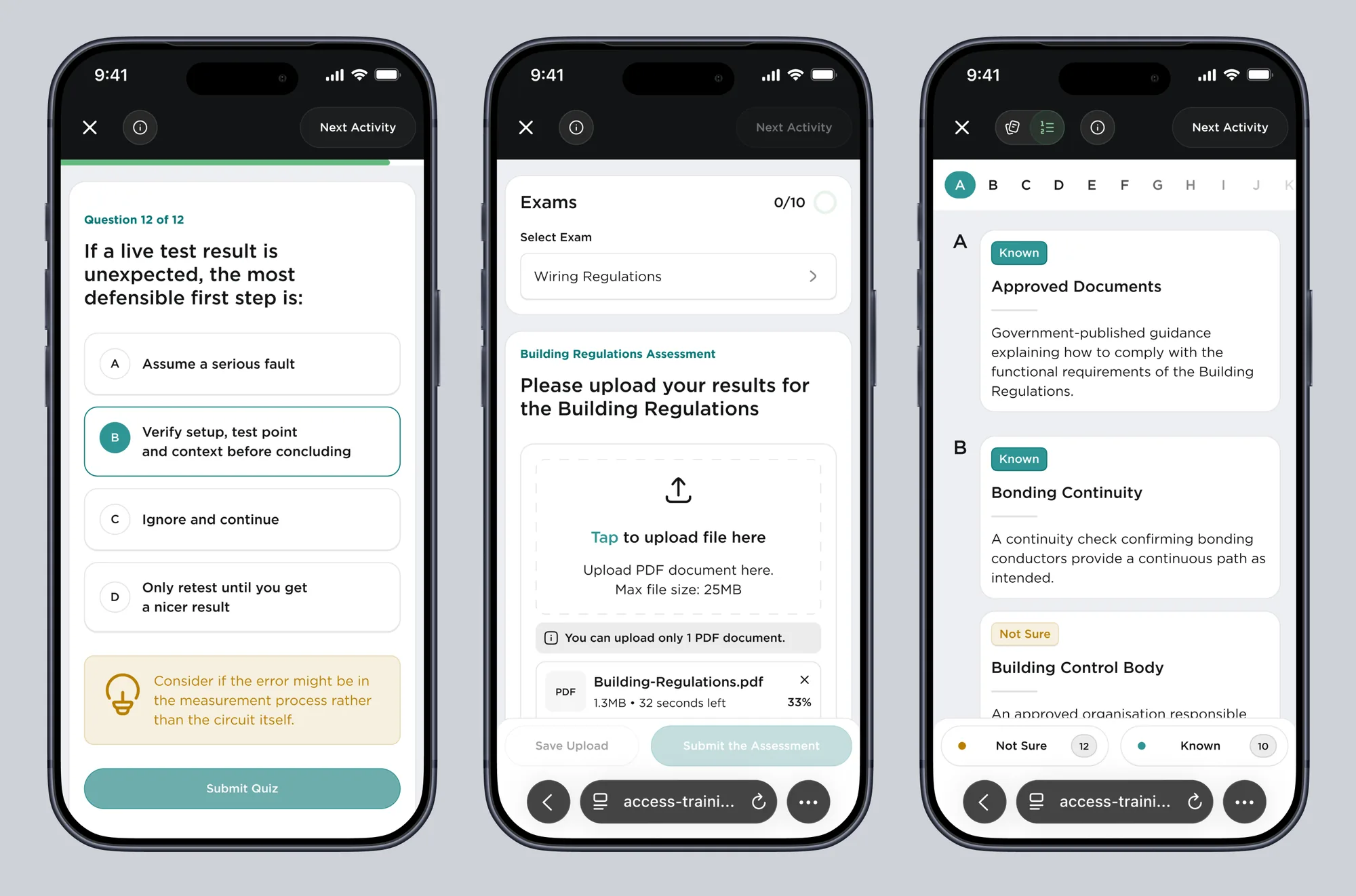
Every learning format has its own screen: video lessons, webinars, quizzes with hints, a glossary where students mark terms as known, and exam uploads with clear file limits.
A design system developers can read
Around 70 screens, two themes and two breakpoints needed one source of truth. I built the system on 510 variables in three collections: primitives for raw values, a theme collection with light and dark modes, and a layout collection with desktop, mobile and static modes.
The dark theme comes from the tokens, without a single screen drawn by hand. On mobile the spacing scale shifts one step down; the static mode keeps fixed sizes where a component shouldn’t shrink.
Every component has a spec with its states and behavior rules, and a short guide explains to developers how to read the specs and the token architecture. We walked the developers and the product manager through it on a call.
I used Claude Code to structure and name the tokens and to write a small Figma plugin that highlights layers not bound to the system and shows what’s missing: a text style, a color or a token.
Marketing website
A multi-page website that explains the courses and the training format and leads people to enquire and register. This is its home page.

Status
The platform is in development, and the developers are building it with the design system and specs. There are no product metrics yet.
Perspective AI